


 |
It's May 28th/29th, 2015, and we all know what that means!
Google I/O!!
In this post, I will talk about my first impressions with the Android M Developer Preview and look at some of the UI changes because AndroidPolice is too good at finding hidden features.
Keep in mind that I played with the Dev Preview for an hour until I reverted back to 5.1.1 because, well, it's a beta, and there's not much.
Start screen


Let's start with the most noticeable change. When you first boot up the phone with Android M, you'll see a few color changes.
On Lollipop, the background is actually the exact same thing, except green.
The selection for language on the first page has been simplified to a drop-down menu rather than a preview of the selections on Lollipop.
The blue and yellow themes are transferred to the rest of the other startup screens.
Lockscreen
 |
| dat font |
There's a few changes in the Lockscreen on Android M.
The clock's font is bolder, which is more easily noticed when using ambient mode or for quickly checking the time.
The font under the clock has changed a bit for the better, and is now all in capital letters.
The font is now bigger, more refined, and overall more aesthetically pleasing. I love it.
I don't believe it's using the typical Roboto font that just went open-source, because this font is glaringly different from all the other fonts present in the lockscreen, as seen with the T-Mobile on the top left.
On the bottom left, there is now a microphone icon where the phone icon used to be.
Before, a quick swipe to the right would bring you to the dialer—but now, it opens the microphone from Google Now, which allows you to do more things: call someone, send a text, get directions, and all that other good stuff.
Some may argue that a voice action is less convenient than going to the dialer when in public or in quiet places, which is true—but it brings more options at the same time.
I would be on the side in favor of the traditional phone app, however.
Camera
 |
| thin circles are so modern |
While we're at it, let's take a look at the icon that stayed on the right of the lockscreen: the camera.
I didn't think there would even be a change in M, but there is—the focusing interface is now simplified into a thin circle that expands and contracts while focusing.
The exposure bug in Android 5.1 is also fixed—users, including myself, were unable to change the exposure values in any camera app. In low-light, images would be much more darker than they should be, which is especially noticed in apps like Snapchat.
That's basically the only things that have changed.
Moving on!
App Drawer
 |
| People will hate it, but I prefer it |
Looks like Google is bringing the app drawer back to the Gingerbread days.
When Ice Cream Sandwich came around, Google switched to a horizontal-scrolling app drawer, which became adopted by every OEM, except... HTC (and Microsoft, but they don't count).
When I first opened the drawer, the very top row did not appear. When my phone began updating Google's core apps, they appeared. Therefore, at the top, you are greeted with a row of icons that were either recently touched or modified.
Eventually, the top row will be tailored to the apps that you frequent the most—allowing for faster access to apps—though, quite honestly, I won't be using it that often.
You may miss it at first, since it's only 1 DP (density pixels) in thickness, but there is now a slider which allows you to scroll through your apps much more quickly than ever before.
Apps are organized in alphabetical order, so the slider should work in tandem with the order very well.
My normal setup on Nova Launcher is actually set to use vertical scrolling with a slider, so I am pleased.
However, I can see many, many people holding their pitchforks at Google requesting to bring horizontal-scrolling back because it would showcase many more apps per page.
I'm predicting that Google will implement an option to switch between the two.
Notification Shade and Volume Controls
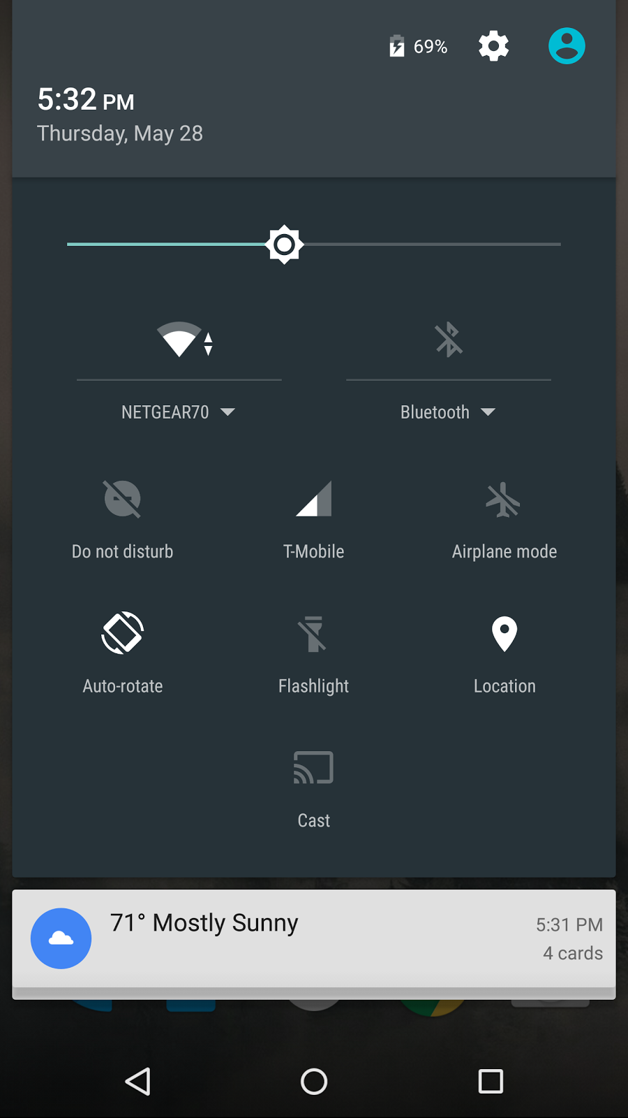
As a new feature in Android M, the toggles are now customizable, which I will get into soon. The newest toggle by default is Do not disturb, which... does exactly what it should be doing.


That bring us to volume controls, arguably one of Google's biggest mistakes in Lollipop.
Google took note that users hated that they removed the entire silence mode, which is done in KitKat and below by lowering the volume past vibrate mode.
In M, Google brought it back, which, when toggled, greys out the vibrate icon and shows that only alarms will be able to break through the silent mode.
In addition, the ringer is now accompanied by a drop-down icon on the right. When pressed, the menu is expanded to reveal media controls and alarm controls—something that custom ROMs and some OEM skins have been implementing for quite a while. Now, it has made it to stock android.
It's a small, yet powerful feature that will definitely please a lot of users.
Whenever I open an app that I know will play a loud sound on start-up, like, say, Kingdom Rush, I'm always trying to hold down on my volume button to lower it as quickly as possible but am always shown the dreaded ringer volume instead of media volume. Thanks, Google!

When pressing the volume rockers in Lollipop, None, Priority, and All appear under the slider.
In M, they're gone and have been moved under the Do Not Disturb toggle.
Google's Now On-Tap


It's not called Google Now On-Tap, but rather Now On-Tap.
In Lollipop, holding down on the home button would bring the playful Google Now animation to appear. In the beta, Now On-Tap doesn't work in this release, but neither does the Google Now swipe gesture.
In my experience, the Now On-Tap froze a few times which was only fixed by a reboot.
However, going into Google Now settings brings up a new toggle: Screen Assistance, which is what Now On-Tap is. Now On-Tap is a major Android M feature that can analyze text in the current screen and can show relevant information.
For example, at I/O, it can bring up relevant Google Now cards based on the current screen information. If you're talking to a friend about the new Inglourious Basterds addition to Netflix, activating On-Tap would show up information about the movie, without even telling it that you wanted to know more about it.
Changes in Settings
Doze: Better battery management
 |
| Wake-lock be gone! |
Under the battery section in Settings, pressing the three-dot menu reveals M's new battery optimizations, codenamed Doze. According to Google, they used two Nexus 9's—one with Lollipop, and one with M—to test the battery standby times. The one with M yielded a longer lasting battery with up to double the standby time compared to Lollipop.


The first thing many of us do when getting a new version of Android is going to the easter egg. By tapping on Android M repeatedly, you're greeted with the M logo, featured on the top of this post.
When you hold down, it should bring up the easter egg as usual. However, since this is M and not the full release, it does not exist and will instead give you a kaomoji in the meantime.
Instead, I tapped the build number repeatedly to see what's new in Developer Options.

At first glance, I noticed there's more options for USB Configuration, such as RNDIS, Audio Source, and MIDI.
Annoyingly, the default option when it is plugged into a computer is set to "Charging only", and doesn't stick to what I set it to when I unplug it and plug it again.
I was having difficulty flashing the Lollipop factory images because it stayed in charging mode and couldn't fastboot with ADB.

Scroll further down, and there's an option to toggle the settings into Light Theme, Dark Theme, or Automatic.
But that's not the only thing!
Right above the theme mode, there is Show SystemUI Tuner.
When you toggle it, it seems like it does absolutely nothing.
But you have to leave the developer options to see the new tab appear for SystemUI.
Doze works by analyzing the movement of the device and recognizes when to enter a low-power state with fewer wake-locks when the device isn't being used (not moving) for long periods of time, such as at night.
However, it doesn't solve the problem to wake-locks in your pocket.
In the battery settings, you can choose which apps to ignore the Doze optimizations.
The Small Changes


There is now a Google Tab in settings that actually brings you to the Google Settings, and that's about it.
In Backup & Reset, however, there is now a feature that allows you to back up app data to Google Drive (up to 25mb according to the Google site) which allows for easier setup on new devices or for restoring a device after a factory reset—something a lot of custom ROM users deal with if they don't use root methods like Helium or Titanium Backup. Best of all, it's all stored in the cloud.
There's also a Network settings reset, if you ever lose or mess up your carrier APNs.
Developer Options
 |
| It's called a kaomoji, you simpleton. |
The first thing many of us do when getting a new version of Android is going to the easter egg. By tapping on Android M repeatedly, you're greeted with the M logo, featured on the top of this post.
When you hold down, it should bring up the easter egg as usual. However, since this is M and not the full release, it does not exist and will instead give you a kaomoji in the meantime.
Instead, I tapped the build number repeatedly to see what's new in Developer Options.

At first glance, I noticed there's more options for USB Configuration, such as RNDIS, Audio Source, and MIDI.
Annoyingly, the default option when it is plugged into a computer is set to "Charging only", and doesn't stick to what I set it to when I unplug it and plug it again.
I was having difficulty flashing the Lollipop factory images because it stayed in charging mode and couldn't fastboot with ADB.

Scroll further down, and there's an option to toggle the settings into Light Theme, Dark Theme, or Automatic.
But that's not the only thing!
Right above the theme mode, there is Show SystemUI Tuner.
When you toggle it, it seems like it does absolutely nothing.
But you have to leave the developer options to see the new tab appear for SystemUI.
 |
| All I want is a Sync toggle... |
It's a good start by Google to allow customizability to the toggles, but it's very limited now, and doesn't work in this M preview.
You can, however, remove toggles from the list and don't have to see them ever again.
This works great for when you try out Invert Colors for a second and have to deal with the toggle (unless you move your clock forward a month).
Actual Usage
Since this is a Developer Preview, I didn't expect it to be stable or run smoothly. Nonetheless, it was very fluid for the most part, except for dropped frames when using the newer features. It could have been used as a semi-daily driver, but I wouldn't risk it because of the freezing On-Tap feature.
On a final note, I might be crazy, but I swear the ripple effect when you tap or hold on things in the settings have slightly changed. I can't verify it because I don't have a second Nexus device to compare it with, but I can feel a difference. Maybe M is making me delusional already.
Unfortunately, I was unable to play with the new Google Photos app because it didn't update yet and I was experiencing too many problems with the freezing and had to revert immediately.
Unfortunately, I was unable to play with the new Google Photos app because it didn't update yet and I was experiencing too many problems with the freezing and had to revert immediately.
Conclusion
Overall, I'm liking what I'm seeing on the M Preview. Since 5.0 Lollipop was the major overhaul, there won't be many visual changes, but rather under-the-hood improvements such as Doze or app data backups.
As of now, I'm not as enticed or excited for the M release just yet because of the lack of the major features showcased at M like On-Tap. When the time comes for the new Preview, however, I will report back with a Part Two.
Thank you for reading, please provide questions, comments, or concerns through the comments or through email.
As always, I'll catch you guys in the next post...when I have time for that.
--


No comments:
Post a Comment